ARB: Alliance Rulebook Beta Feedback

Status
Not open for further replies.
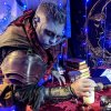
I am disappointed that a race with three makeup variation options had only one color photo showcased. 'Dark Elves have gray, dark blue, or purplish skin, white or silver hair, and pointed ears.' I would like to see the make-up variety in the description reflected in the book.

Amanda

I didn’t actively check all the pictures in the book; was there only a single Dark Elf photo in total?
 
I didn’t actively check all the pictures in the book; was there only a single Dark Elf photo in total?

Yup only one on the dark elf page. The other dark elf like ones are a Panther and a bat.
 
I didn’t actively check all the pictures in the book; was there only a single Dark Elf photo in total?
I saw two that I would distinctly call dark elves and not dark coloured kin, and both of those were a very dark gray, almost dare I say, black, in colour.
 
I kinda understand that; there’s only one kyn picture. I definitely would have appreciated other DE photos to show different makeup options, however. Not necessarily in the DE section, but scattered in the books.
 
As a dark elf player who was really excited about the new options in skin for the dark elves, I'm extremely disappointed that we get a singular representation. And at that, one of makeup that hadn't been retouched in several hours.

While I'm upset at the sexism showing through, it bugs me more that we're showing bare minimum makeup as the standard (and not just with the lone dark elf representation). I've played alliance on the west coast and was wowed by some of the makeup i saw. It inspired me to up my own makeup game. To see what's going to represent us as a game be dozens of recycled images and a good chunk of the others be so-so hurts my heart.
 
I am not going to go into word choice, grammar and the like. There are people much better at it than I am. I will speak on general "look" and aesthetics of what was expected and what has been released...


I am overall disappointed by how many pictures are simply recycled from the fist book. I am told many of those pictures are from a Nero era and generally feel that Alliance should be squarely capable of moving on and showcasing its own flair by this point in its continuing development. Not to mention a dis service to all of the dedicated new Alliance players, and equally so the old Nero players. While those pictures can be pretty amazing; they don't really "represent" alliance - they "represent" Nero and this is a prime opportunity to showcase our own pictures and our events.

I saw a post somewhere that the overall format of the book was going to be altered with regards to text/pictures/tables and that the book would be overall "easier" to read. I couldn't really tell the difference in the two book's formats, and don't really think that the 2.0 Beta book has a different layout/formatting at all.

As it concerns pictures.
* There are numerous pictures showcasing the same or similar actions. This repeditive nature of photos is largely unnessecary and could instead be used as page space for different photos which represent a different topic.
* There are numerous pictures "in-line" with a topic which have nothing to do with their "in-line" content. Which creates a "fan service" for those players, which while nice - has nothing to do with the topic being discussed in text. Which is a photo opportunity which could be used for something more accurately relevant to the in-line text. Granted, not every topic will have an available photo. Which is fine, simply don't use a photo in that location. Safe the space in the layout to redistribute that image to another location where the photo can be less tied to the in-line text. Especially for text regarding variations where multiple photos showcases that variation. Such as Wylder Kin, Dark Elves, Formal Ritual.
* Each section has different "flow" to its formatting, and some sections the formatting is different from item to item. This should be brought to a uniform. This is especially true in the Races. They should have their makeup requirement, advantage and drawback follow the same flow and same formatting for each race. Each Race should have a picture which showcases their expected appearance. Wylder Kin & Dark Elf, should have several pictures which showcase their variety.

I agree that the Selunari photo, the Gem looks very small and perhaps out of standard. I also think that likely because of the angle+distance. The player appears a fine choice for the photo - and I would hazard has other photos which more clearly accentuate both the Selunari appearance, and costume requirement.

There was a re-post regarding photo quality/format. Having now seen the beta book - it is a very noticeable problem. I really wish the quality/format was addressed in the request for photo submissions. As a lot of these pictures are good, and it would be a shame not to use them. But overall the book "should" have a professional Quality and some of the picture format/quality detracts from that overall professional book "feel"

On a personal, As a Dark Elf player, I feel a little lack luster with the Dark Elf photo included. I feel like the player's appearance most likely simply not photograph well, and that more than likely they look great in person. But the Angle+lighting blend their makeup and hair to the same color as their skin. if it wasn't for the black "sunken" appearance for the cheeks the character could (from this photo) be just as easily a Stone Elf. As has been impressed upon me by my Racial Martials; there should never be a question as to who your race is and should be able to be determined at a glance, from a distance. To which I take, (a) my marshals could just be more "strict" &/or (b) Light, shadow, & angles which have the possibility to confuse your race, and should be corrected - not included as "the example". An equal possibility is that the photo is simply low resolution, which goes to my initial point that the player likely looks great in person. Additionally as a Race which has 3 specific color make up requirements, there should be a minimum of 3 photos which showcase each of them.
 
I saw a post somewhere that the overall format of the book was going to be altered with regards to text/pictures/tables and that the book would be overall "easier" to read. I couldn't really tell the difference in the two book's formats, and don't really think that the 2.0 Beta book has a different layout/formatting at all.

I noticed that the format was changed to have it read in one column. The previous one had a 3 column layout which was difficult to read on phones/small screens, always having to go back to the top after reading the column. This format for that seems to flow better for me when I read it from my phone
 
<Putting on my Admin Assistant Hat>
Here is what I have found thus far.

Page 10, Paragraph 3, Last Sentence
Suggest changing “There always is a reason.” to “There is always a reason.”

Page 16, Paragraph 1, 3rd Sentence
Suggest changing “. . . but are not in any way compatible.” to “. . . but are not, in any way, compatible.”

Page 17, Paragraph 7, 2nd Sentence
Change “. . . and the like to win.” to “. . . and they like to win.”

Page 20, Paragraph 4, 2nd Sentence
Change “. . .making off all sorts.” to “. . . making of all sorts.”

Page 22, Paragraph 9, Last Sentence
Change “. . . then Out-of-game. . .” to “. . . then out-of-game. . .”
 
Page 118: "...only be NPC abilities (such as Enslavement or Vampire Charm)."

Also in general, the race chapter has pictures that have no real consistency in size or page placement, giving the whole section a less polished feel.
 
only two comments for this thread before this gets out of hand.
1. there is no costume requirement for ANYONE in 2.0. That's a simple statement and it was clearly intentional to remove these to let people make their own style as long as it includes the makeup/prosthetic required. I love all the variety you see between people of the same race in the book and think its valuable for the game as a whole
2. the people in the pictures had no input on WHERE their picture was used, just that a picture got submitted or in some cases that pictures could be used in general not specifically for the rulebook. Comments on wanting to change or move pictures are great for making this the best rulebook we can, but comments on the people in them can be extremely rude.
Edit: didnt see the oathring and it does exist as the one costume requirement that isnt makeup or prosthetics.
 
Last edited:
only two comments for this thread before this gets out of hand.
1. there is no costume requirement for ANYONE in 2.0. That's a simple statement and it was clearly intentional to remove these to let people make their own style as long as it includes the makeup/prosthetic required. I love all the variety you see between people of the same race in the book and think its valuable for the game as a whole
2. the people in the pictures had no input on WHERE their picture was used, just that a picture got submitted or in some cases that pictures could be used in general not specifically for the rulebook. Comments on wanting to change or move pictures are great for making this the best rulebook we can, but comments on the people in them can be extremely rude.

A slight requirement for 1. The oathring.

Other than that, yeah.
 
Chris (The person who plays the dark elf) doesn't check the boards a lot, and I'm pretty thankful for that. Cause I'm sure this would super deflate him.

I actually really like his makeup as Drexel, I think the website picture is a bit better. But, both in person and in the picture I think it looks great.
This picture is from the very first weekend of the change, and I think he nailed it.

I also know that, when I got his picture on the website, it was such a huge deal for him. He told me if he got into the book, he'd get it framed.

So, these criticisms kind of suck to read.

We're a national game. So, I suspect that the image selection also took into account chapter representation. This is literally the first copy of the rulebook that has stuff from the midwest in it.
 
I'm going to second that nothing is "wrong" with the Dark Elf example photo, except MAYBE that it looks kind of on the grainy side, as though the photo had its resolution decreased through enlarging; you can still clearly tell at a glance that it's a Dark Elf in proper makeup and ears, and the grey isn't so light as to be mistaken for unpainted white skin. At worst, the makeup could use a slight touchup and better lighting angle, but it still looks great as an example.
 
I’m gonna straight up disagree with the assertion that the dark elf picture was bad. I like it, and I think the photo was great.


That being said, I definitely would also have loved to see other representation of their hue choices. Gray is certainly the closest to their previous color spectrum, and I suspect that some folks would have appreciated seeing something further away from that. It would feel more “embracing” of the change, if that makes sense.

But that guy’s makeup and picture are great, and deserves more respect, and I am sorry to see such treatment of it.

I am really glad the Midwest is getting representation in this book; it is absolutely deserved.
 
Last edited:
I thought the DE pic was good. I can agree with the sentiment that other color options should be shown... but I also feel that way about Dryads. (They have 4 choices...)

Tell him grats. It's super cool to be your race's rep. I know I loved the heck out of it when it was me!
 
I think photo of Chis as Drexel looks great. He worked really hard on his look. I'm guessing not every photo can be used and yeah, with races with options (Dark elves, Kin, Dryads etc) you're going to get different looks and you can't represent everyone's look. So, let's just be excited for him looking awesome and not bash him. Cool? Cool.
 
"Stone Elf" and "Sylvanborn" are not in correct alphabetical order in the races list. "Sylvanborn" should come second.
 
Last edited:
I feel there might be a misconception on the make up of our Dark Elf friend. It was the "not reapplied" comment that got me. His make up is ash grey with soft brush applied darkened spaces to give his features some more sharpness to them. I think the expectation many players have had was that Dark Elfs choose gun metal grey when they go grey. This is more ash based. Drex had some top notch pictures so I am attaching two more to help other perceptions here. This is dedicated player with an amazing kit, great role-play, and has taken the new makeup requirements very seriously.

On a personal note I have tried the gun metal grey and no one can tell the difference really between that and the black of yesterday. Certainly not at night when dark elf players play more often. It really needs to be a solid grey color to avoid past comparisons.

I'm attaching another picture of him. This is easily my favorite dark elf photo period. Note that the blue light of the celestial guild is coloring him yet another DE color but that wasn't intended. The grey of his hands was partially removed by gloves and just like the blue light the yellow beam of light behind him is also coloring the grey there.SoMi Alliance Picture Submission Races-21.jpg
 
Status
Not open for further replies.
Back
Top