Lets share our logos and get feed back.

Throck14

Newbie
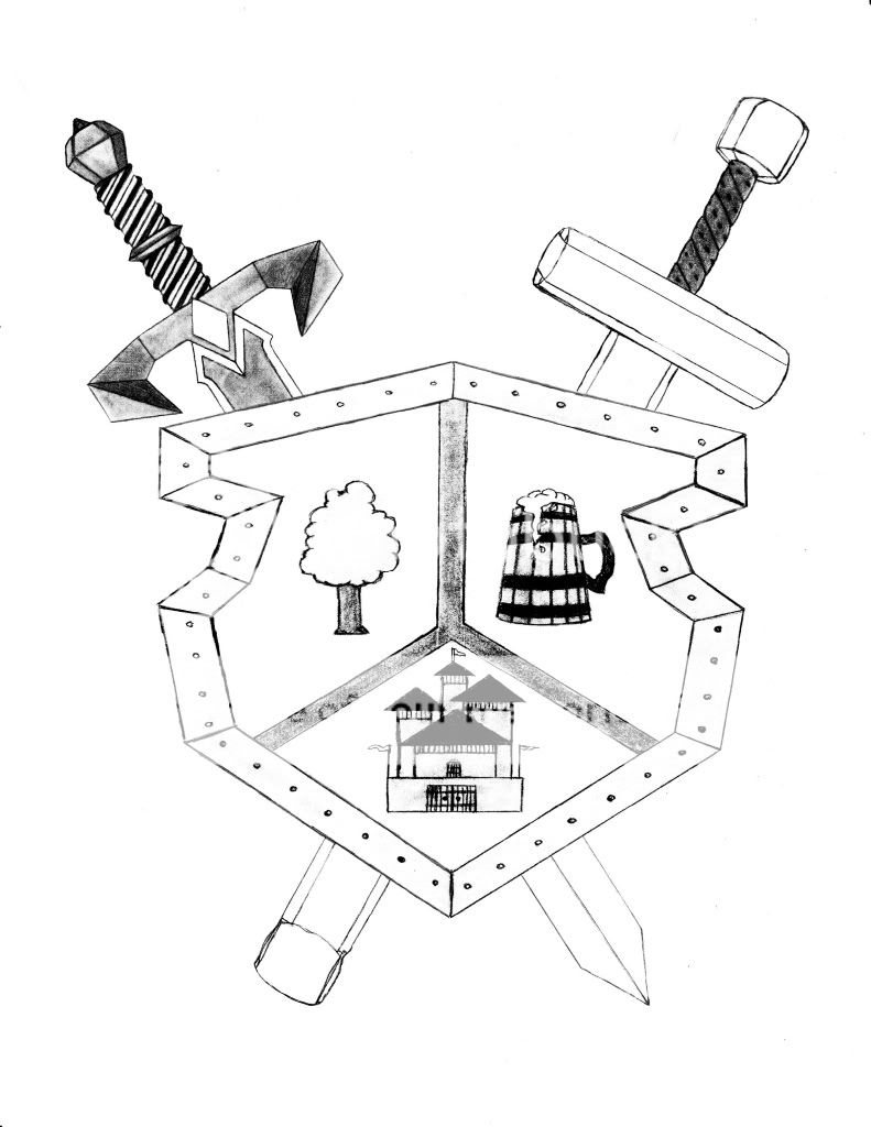
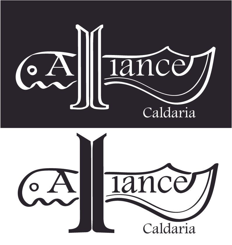
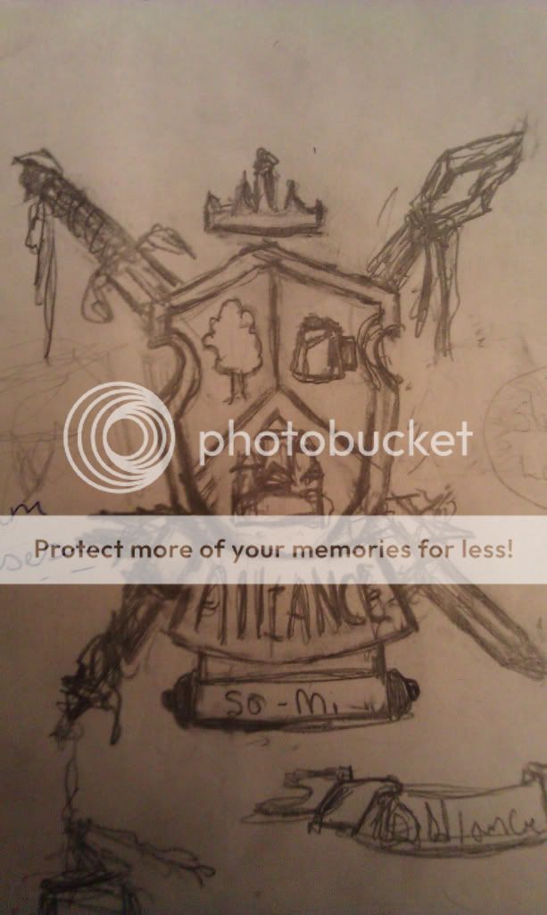
Figure i would throw up the idea i had for the logo design and see what people thoght so far was just the first idea that poped into my head so far so i put it down on paper. Feel free to crituqe it say what works or not so i can tweak it and make it better thanks everyone.
Also if you got logos and want to post them we can see them that would be awesome no pressure tho.

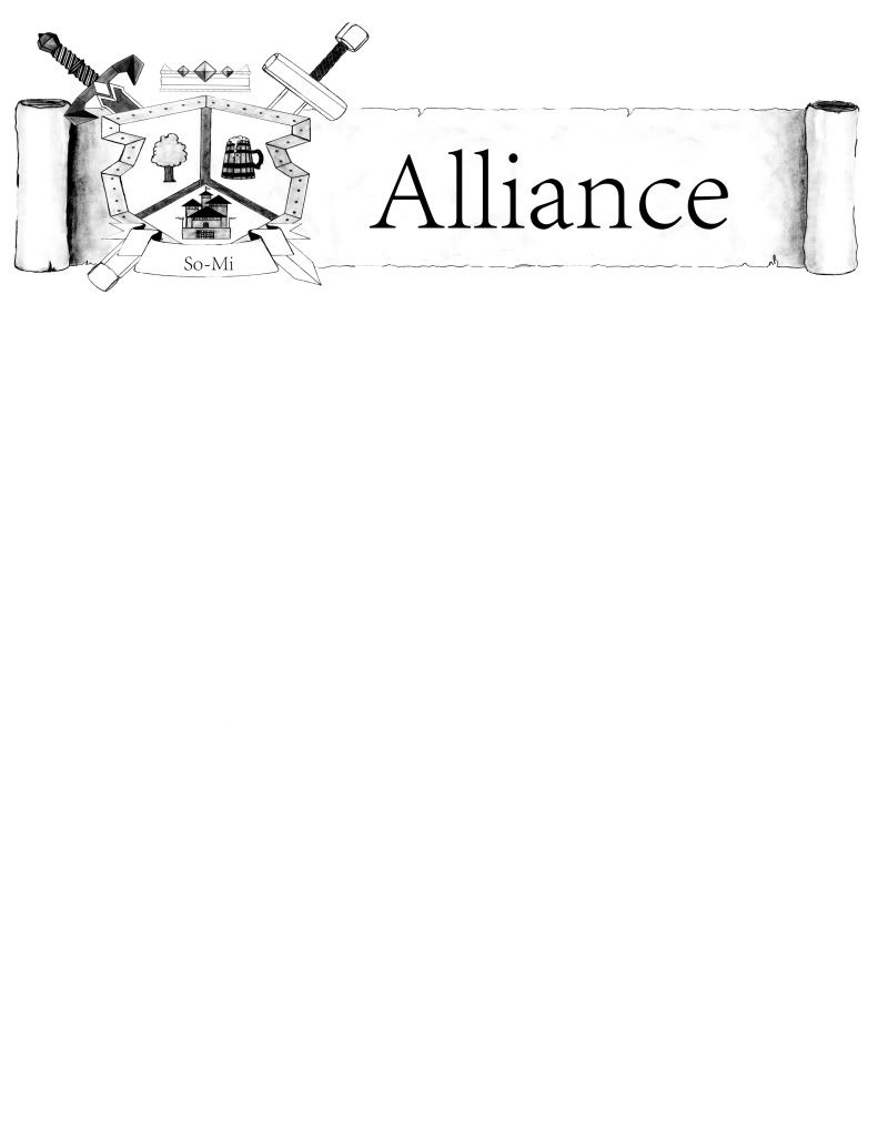
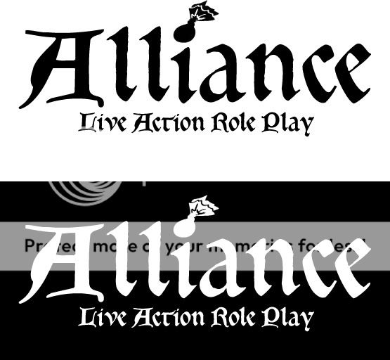
The Caldaria can come out real easy i know now i did not need it in, just showing that you could add on any chapter name there.
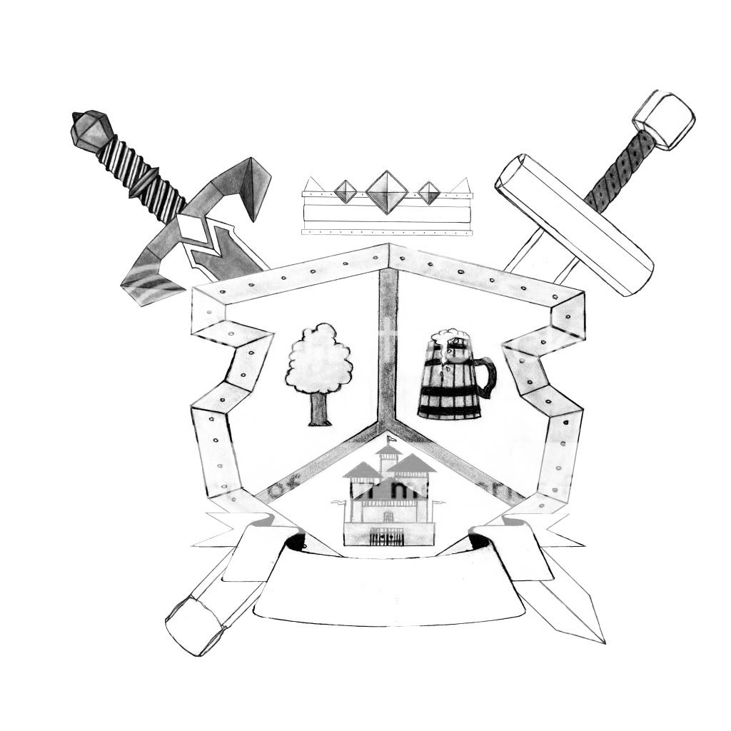
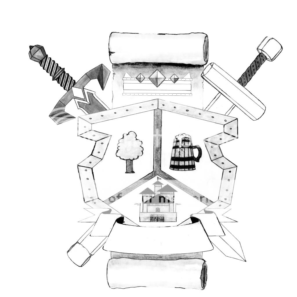
Top one a little different then the bottom also rate what one better.
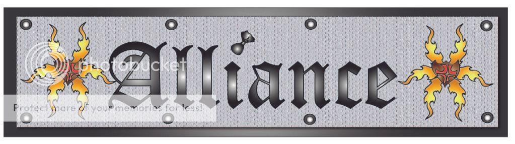
Alliancelogo.jpg
 
I like this in general but the stylized Ls make it harder to read ... You have to look at it for a second or so to read it properly, and I'm not sure a logo should do that (although I am no expert)
 
I'm focusing on literally just the A in Alliance LARP. This is what I have come up with thus far - using a stone carving for a base. The idea being that all some gamer needs to see is the first letter and know it means Alliance LARP.

A3.jpg


Oh, and here's a button I made for a simple logo design:

AButton.png
 
First off thank you for your responses. And second here are a few more i been working on see if you like these any more or less kinda used the same text because i liked the look of it. If you look at the I it is a seed packet it thought that tied in really well. Went for like a metal type of look for the top with some flame things and a shield.
alliancelogo2.jpg

This Image i went nice and simple then i added the other side with magic also on the second one .
AllianceLogo3.jpg

AllianceLogo3a.jpg


Any feed back would be great thanks all.
 
I really like the idea of using a packet to dot the "i"
 
I'm kind of a fan of logo number two in the latest post before Dom's. I also like the packet dotting the "i" because it's subtle enough that it's not distracting, but something that will make the logo unique and noticeable for those "in the know". I would like to see it with the lighter background and dark lettering, though...that way you can see the full plume on the helm better. Perhaps a non-standard font should be used, though? I know that was one of Mike V.'s comments when the announcement was made to create a new logo.

Having something like that helm, which would be identified with only Alliance (out of all the other LARPs), I think is key to success. That helm could be used on its own without the wording, once the logo has become recognizable.

Also, I was looking at the centers of the designs in the first logo...perhaps something like that shape could be married up with markusdark's badge idea to create an awesome anniversary pin.

-Luke
 
I also greatly approve of the birdseed packet tittle. (I learned that word on Jeopardy! :shades: )
 
Credit for the birdseed packet over the "i" goes to Throck14. It was such a good and subtle idea I feel it should be incorporated into whichever logo is chosen. Here is my take with a different font.

Logo1.jpg
 
a little critical feedback for the packet idea... from the eye of someone who doesn't know what it is.. it looks like an exploding bomb. I asked 3 people at my office to look at it and tell me what they saw. They all said exploding bomb.
 
Robb Graves said:
a little critical feedback for the packet idea... from the eye of someone who doesn't know what it is.. it looks like an exploding bomb. I asked 3 people at my office to look at it and tell me what they saw. They all said exploding bomb.

That was the problem I was coming up with and I know what packets are.
I tried a few things like making the Ls as boffers (look silly), A into a large Packet (bomb or just silly O with a tail)...it's tough to come up with a one of a kind logo that stands out.
 
Here is the initial sketch of my idea. I wanted to do a coat of arms of sorts that I could try to depict the values of the Alliance mission while still keeping that fantasy feel. Although this is very rough the basic idea is the obvious shield with a magic staff and sword crossing behind. The Alliance name would be in the ribbon below and below that is an unrolled scroll where the chapter names can be located. A crown hovers above as well. I have been tossing around the idea of putting the heads of mythical creatures such as dragons on the sides of the shield but I'm still debating because I don't want it to become too busy. Let me know what you think.

logo.jpg
 
Love yours Vhossek! I think it is very cool and portrays lots of what that chapter is about :). Keep up the good work man!
 
Vhossek, for the two weapons what if one of them was boffer and the other was a latex one. That would be icing on the cake.
 
Wow, I hadn't even thought to go boffers on that. I will have to do a couple mock ups and see if they read correctly to the average non larper. I can try a couple different ways to display the words Alliance as well. Although I personally wanted to focus more on a symbolic image for the logo. The logo itself if used on different things,(ie posters, hats, t-shirts, websites) would not change on those, but the wording would be displayed differently on all of them if displayed at all.
 
Here is a more finished drawing of the logo. I still have to add the banner and scroll work. The color version should be finished tomorrow I hope.

AllianceLogo.jpg
 
here are the finished black and white versions I did. with a couple options.

banner versions
LogoBanner.jpg


Logo with no scroll
AllianceLogonoscrollBW.jpg


With scroll
FinishedStandardLogoBW.jpg
 
Having done a huge convention this past weekend (over 50,000 attendees) with many people not very familiar with larps, a logo has to have a version with "Live Action Role Playing" in it. We had it on our very mediocre sign at the con and more than one person was like "Oh, that's what LARP stands for."

A logo is going to be primarily for attracting new players to the game, so please keep that in mind.

We as players are exposed to larp every day, so it becomes every day to us. We take it for granted that people will know the term. But there were thousands of people at a comic book convention who didn't know what a larp was. And these were all from "geek culture"...comic collectors, gamers, toy collectors, cosplayers, costumers, etc.

Scott
 
Back
Top